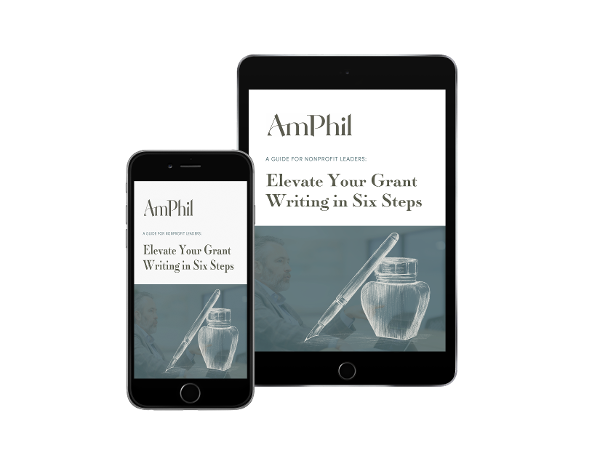
If you’ve followed all the advice on editing and finessing your foundation proposal, you’re now sitting with a pretty great proposal, at least in terms of written content.
But here's the question: Your proposal may sound great, but does it look great?
You eat with your eyes first, so your reader’s first impression is visual. Once she starts reading, high-quality proposal design makes even a well-written proposal more readable while maintaining a good impression throughout.
Here are three design tips to make your proposal shine.
Create Visual Signposts
There are many ways to break up that wall of text before you into something both visually delightful and informative, but we’ll start with your proposal’s headings.
In describing proposal revisions, Iain mentioned that the headings of your proposal should look distinct in order to highlight key ideas and overarching themes. Your reader should be able to see the big ideas and their relationship to one another at a glance.
Ask yourself: Do my headings visually stand out from the rest of the text and are they consistently styled?
To achieve a simple and effective hierarchy between your headings and body copy, consider exaggerating the scale, color, and font weight between the two sections. Is the body copy set to 12- or 13-point? Try a 24-point heading in your organization's brand color(s). Headings can be smaller than that, too, as long as there is a distinct enough contrast between heading and body paragraphs.
The design goal for headings echoes the writing goal of your proposal, but in a visual way. Making your headings pop off the page in relation to your body copy will immediately improve your grant proposal’s design. These “visual signposts” will guide your reader, making the reading experience more enjoyable while also aiding comprehension—both of which will help a favorable outcome!
Think of Typography as the Visual Form of Your Words
One of the easiest ways to change the look and feel of your proposal is the change the font (or “typeface” if you’re a design nerd like me).
You’ve meticulously chosen and crafted the words of your proposal, now it’s time to choose the fonts that will aid readability and engagement. In a similar way to how writing has a style and tone, the fonts you choose carry with them a personality. When you get this right, your message will come through in a more convincing and engaging way.
If you haven’t spent time studying the fine details of letters, there’s no need to fret. A good place to begin is simply noting the differences between Serif and Sans Serif fonts. Serif fonts like Times New Roman and Garamond have finishing strokes at the end and (in general) feel more traditional and formal. Sans Serif fonts like Arial and Helvetica do not have ending lines or shapes and appear more contemporary and streamlined.
To find some inspiration and guidance for font selections (if you don’t have prescribed brand fonts), run a quick web search for “font pairings” to get started. It’s also easier than ever to find and use solidly designed fonts. A good (and free) place to start is Google Fonts. You can browse a large selection of font styles and weights and even see how sections of your writing will look in each.
But don’t get carried away with fonts once you find a few that you like! Be sure to limit the number of different fonts you use in one piece: two or three maximum is a good rule of thumb.
Bonus Tip
After you’ve settled on a couple of fonts for your proposal, consider which words or phrases you might especially like to highlight.
Is there a great quote that really captures the essence of a particular section? Try making it really pop off the page by exaggerating its scale, color, weight, and position on the page for example.
Does your proposal include numbered and bulleted sections? Grab the reader’s attention to what’s being said while reinforcing your brand by applying color to those markers.
These are just a few ways to leverage typography in your proposal. One final, but critical note: No matter the font(s) you’ve chosen, the design of your proposal should be in service of your content—and not a distraction, or even worse, a hindrance.
Let Your Writing Breathe
If you’re not limited to a specific page count or have achieved an economy of words that leaves room for white space (areas with no content at all), consider yourself fortunate! Part of a good proposal design is making it comfortable to read, and white space can be your best friend in this regard.
These areas should be incorporated purposefully since they allow for the reader’s eyes to rest. It can be tempting to fill every “blank” space on the page, but you should try to avoid that if possible.
White space is an extremely valuable design element at your disposal when creating your proposal. You can leverage this element and create opportunities in your layout to reinforce distinctions between sections, call attention to a specific idea, and generally achieve a visual balance. If you consider all of the areas where there is “nothing” on the page, you get an idea of how powerful white space can be in your design.
How Letters Use White Space
For example, at a granular level, the letterforms you’re reading now use white space (or counter space) to make them legible as distinct shapes that correspond with specific sounds and form certain words. The center of the letter “O,” for example, needs white space to be an “O.
Okay, so what does that mean practically for your proposal design? White space helps frame your content at every visual level.
These spaces are present between letters, words, paragraphs, images, and in the margins. Use them to your advantage and you’ll be on your way to a proposal that feels visually balanced and well-considered.
Conclusion
Needless to say, there’s much more that goes into crafting a professionally designed proposal. And proposal design can run the gamut from introducing mild design elements to “uplift” your proposal to extensive design to turn your proposal into a highly designed visual artifact.
Where your proposal falls on that spectrum should be based on your organization’s brand identity and the use case of the proposal (who is it for?). But in the least, you should work to improve the visual appeal of your proposal.
When your reader eats with her eyes first, make sure your proposal sets a good precedent and leaves a strong first impression.