Life, friends, is boring . . . the sky flashes, the great sea yearns, we ourselves flash and yearn.
Or, to adapt John Berryman for 2024: Life, friend, is noisy. TV news, social media posts, cellphone alerts—they flash all around us and clamor for our attention. Meanwhile, as a fundraiser, you yearn to cut through all that noise and get donors to focus on you, your message, and your mission.
That’s easier said than done. It’s incredibly difficult to make your message stand out . . . and you have only a few seconds (if you’re lucky!) to grab your reader’s attention before some other shiny object catches their eye.
So how do you keep their eyes on you? In short: you need to make your language compelling and your design appealing. Make the reader want to keep reading.
Let’s look at two key elements of ensuring your story looks and sounds great—and that your organization reaps the benefits.
Write for the Skimming Reader
You’ll spend hours carefully crafting an appeal letter, donor prospectus, or email, but your typical reader will spend only a few seconds skimming it—so make those seconds count.
In practice, that means you can’t beat about the bush. Your main idea should leap off the page (and those photons collide with your reader’s eyes). That means no jargon, no run-on sentences, and no dusting off your SAT vocabulary flashcards. Stick to short sentences, short paragraphs, second-person language, and bolding and highlighting, Draw your reader in.
Make Your Outreach Pretty
All the lucid prose in the world isn’t going to convince your reader to donate if they don’t look at it in the first place. This is where design enters the picture.
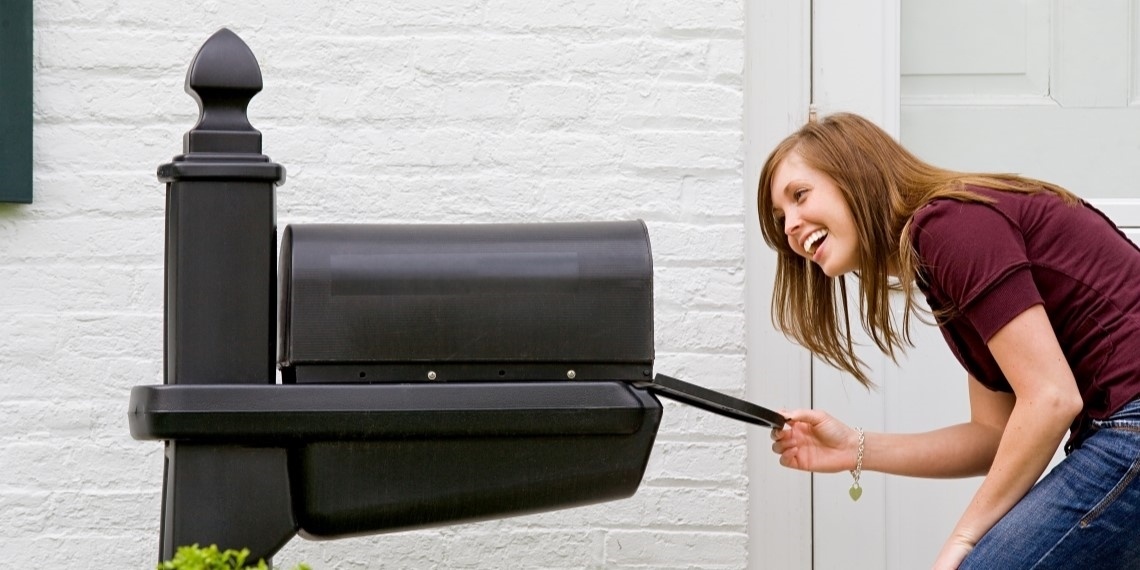
Your quest to draw a potential donor in starts the second they riffle through their mail. You don’t want them to glance at your envelope and toss it in the recycling bin—you need them to open it. Font, imagery, layout . . . they all play a crucial role in convincing the potential donor to break out the letter opener.
Design is even more important once that envelope’s open. Remember how I said your message needs to jump off the page? There’s no better way to make that happen than to highlight crucial text, and add imagery reinforcing your organization’s impact.
A polished mailing underscores your organization’s credibility and ability to fulfill your mission. And you don’t have to rely only on words; you catch the reader through visuals, too.
The long and the short of it is: We live in a noisy, distracting world, and we’re trying to reach a deafened, distracted audience. It’s a tough row to hoe, but with the right language and the right design, you can still get through to potential donors.